Brand Launch—State of the Art


Inspiration

First of all, meet Chris Provins. Some of you may know him. He's responsible for a lot of memorable designs around Edmonton and beyond. He was my top pick after interviewing designers from all over the country. He's thoughtful and obsessed with not just his craft, but the meaning behind his choices. He's an illustrator and makes sketches on paper and not only an iPad. I wanted to work with someone who could handcraft something original. He's curious about everything (like me), loves to drink wine (also me), and Australian (not like me but I do love kangaroos). He is also many other things and I hope you follow him on Instagram because he does incredible work.
Chris had a difficult task—design a new look for a brand that...was working well. Creating something from nothing is one thing, fixing something that is broken is another, but replacing a visual identity that, while dated, is working well? Have fun with that.
We set about with a Pinterest board. You can see a bit of it above.
Some of it shouldn't be too surprising. There's a lot of pink! What was surprising to me is that it was so difficult to find brand packaging that I was drawn to. I had to change my approach and go with themes, colours, places, and textures that I liked instead of relying on finished work to guide us.

Thankfully, Chris likes to push and prod and made me come face-to-face with answering not just what I like, but why? As an artist, I'm often led by instinct and I don't always take the time to reflect on why I make the choices that I do. Part of that is purposeful. I don't like to analyze creativity, but I also want to be able to speak to my inspirations so self-reflection is a necessity. It's a tough balance, but I managed to give Chris just enough for him to knock it out of the park!
Colours

I’ve said it before and I’ll say it again—my favourite colour is all the colours! I secretly hoped that Chris would come to the conclusion that, like a good mother, I have no favourites (except pink) and he would be forced to include them all in my set.
We did not, in the end, go with every colour. Look at what we ended up with though! We wanted to mimic a very specific French paper with our Peachy Peach. If you buy a painting from me you'll receive a Certificate of Authenticity printed on Memo Orange French Paper. It's lovely and has a beautiful texture. The mint and yellow add a new dimension to my visual identity and the maroon, a colour I would never have picked for myself in a million years, is a perfect way to ground it all. It tempers the trendy quality of brighter colours with something classic, while not taking away from its modernity. The maroon transports me to France. It’s wine, it’s leather, it’s the perfect foil for the modern pops of pink, mint, and yellow. I'm in love!
Fonts

It’s been a bit of a running joke that my current logo is a bit, we’ll say, dated. It served its purpose though and I'm proud of what we (me and AlohaBabe.otf) accomplished together! A change was overdue though.
If you're going to invoke the French masters with French paper and rich colours, you need the fonts to match. I don't want to look stuffy though! It's a fine line between class and comfort. I think we found our best of both worlds.

Logo, Wordmark & Pictogram

I know a brand is more than the visuals, but it's the visuals we want to see, right?

The wordmark is a customized version of the Editorial New font. You'll notice many of the letters are joined together and it creates a solid foundation for anything I put it on. It's large, bold, and grounds the more extravagant logo and pictogram. You'll often see it at the bottom of my materials as it feels strongest when its supporting everything else
The logo's more calligraphic look leans into the florals and nature found in my art. It feels organic and wild, especially in contrast to the wordmark. You'll see this a lot as I use it to stamp my prints and anything else I can put it on.
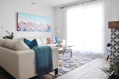
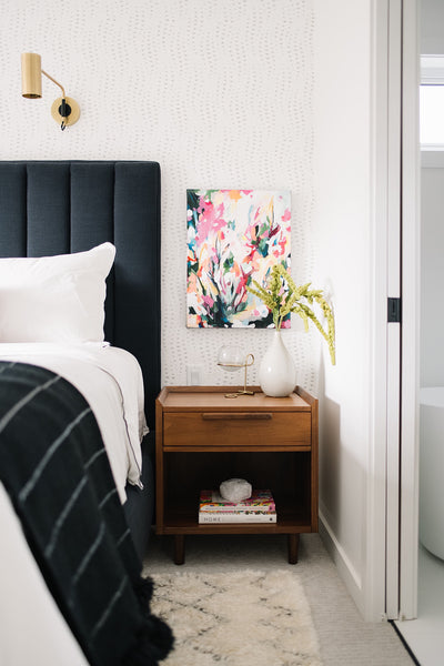
Finally, the pictogram. My gosh. This is a piece I hadn't thought of coming into this process. In Chris's sketches, he made a small drawing like a window or an arch with an image of me painting in it. It was one of the smallest things on the page but I couldn't get it out of my head. It felt so iconic and memorable, even as a sketch. Seeing the final version paired with everything else...I can't imagine this package without it. I'm going to get a mug made with it. I'm putting it on everthing!

Extras
There's a handful of other elements I'll keep back for another day or maybe you'll discover them on your next order. I'll share one last piece that was added near the end. It added such a nice touch of whimsy to everything and allows me another way to share my art. You'll find these stickers on your packages in the future and I'll switch them up from time to time to reflect my most recent work.

Final Thoughts
Phew! It's out there in the world now. I feel like I've been holding a secret for months. I couldn't be happier with the results of this exercise. Chris is an absolute gem and incredibly talented. I feel like we've created something together that will last many years to come, will stand up to trends as they come and go, and will be a hallmark that grows and evolves with me.

This brand represents something else too. My success can be attributed to everyone who has helped me along the way. Whether you're a collector, a shop owner, someone who likes my Instagram posts, a printer, my barista, a fellow artist, anyone who I've met at art shows who just came to say hello—thank you. This is a reflection of your support and investment in me as an artist and I think a great deal of you.
I hope you are as proud of this work as I am and I can't wait to paint more for you.


Thank you for sharing your personal journal memos with us! This well-thought-out blog was such a pleasure to read. You’re an artist through and through Amy. Bravo!
“It’s wine, it’s leather, it’s the perfect foil for the modern pops of pink, mint, and yellow.” Such a good line!
Congratulations, Amy! This is all so exciting! So thoughtful, graceful, and beautiful. It’s the perfect fit.
This is so amazing Amy!
Love all of this – especially the bts of your own thoughts and process in developing the new brand! It’s all so so good!
Leave a comment